


Did you know that Spain has the biggest vineyard surface in the world? That sure proves the country’s dedication to its wineries! And when it comes to bottle wine, the usual dark green bottle with boring label is out. We present you 10 creative wine bottles designed by Spaniards!
Roberto Espartero, “Soneto”, Bodega Arbocala
“Soneto” is the Spanish word for sonnet, a form of poem. Roberto Espartero explains that a sonnet is “the most harmonious poetic composition (…) It is also the most difficult to build.” Indeed, follows a strict rime and rhythm pattern. With this analogy, Roberto Espartero implies that his work is detail-oriented. The “elegant distinguished design, taking care of even the smallest detail” is to reflect “wine of great quality”.
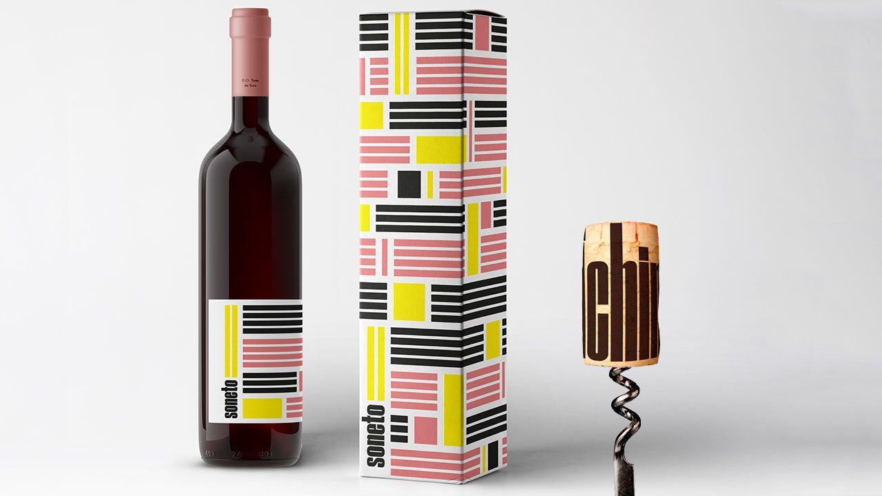
The fourteen horizontal lines on the label are meant to symbolise the fourteen lines of a sonnet. In terms of colours, he chose pop colours, yellow, pale pink, black and white. They convey the idea of dynamism. Attention to detail is to be noticed in this bottle’s design. Even the cork, with which one usually can’t do much with, is taken care of and has either ¡Salud! Or ¡Chin-chin! (“Cheers!”) written on it.
Atipus, “Vins Rojalet”, Celler Masroig
These three bottles were awarded the 2016 Laus Bronze and The Dieline Outstanding Achievement. The label design was inspired by the name of the product which sounded like “rojo” (red) to these Catalan designers and by the red soil where the grapes are grown. The soil was interpreted as layers, that the several lines on each label represent.
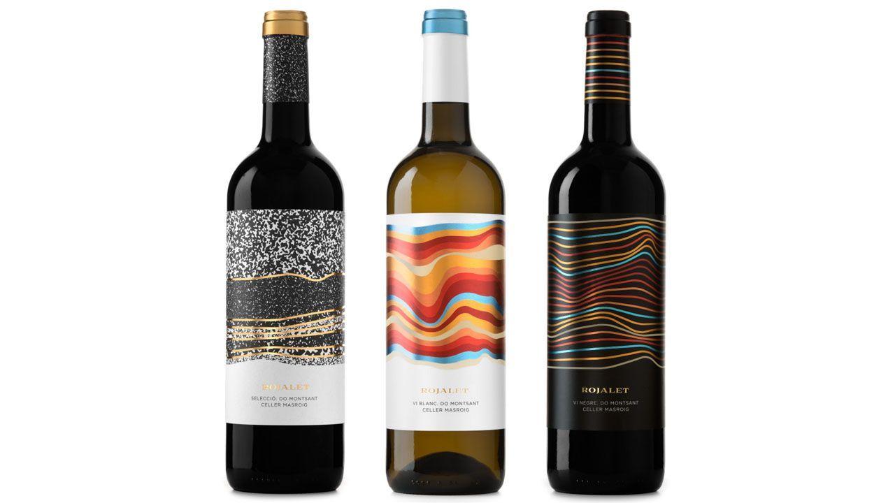
However, the label of each wine is different and embodies the different “colour” and “personality”. The white wine for instance seems more slippery and softer while the red wine, because of the contrast between black and the colours, appears as stronger. The speckled labelled for the “selection” wine is the most reminiscent of the soil, thus putting the emphasis on earth and on the winery. The use of gold also connotes a more quality wine.
Eduardo del Fraile, “Pietra”, Menhir Salento Italy
The Pietra bottle won the Bronze Pentaward in 2012. The elegance and simplicity of the bottle is probably what made it win. The devil is in the details: and here, the foil is what we must look at.
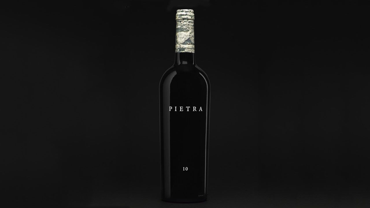
The foil is the typical forgotten piece of a wine bottle when it comes to design. It is usually in one colour and not the main element of the bottle. But here, it is stressed. Indeed, the bottle is all black but for the name of the wine and the number 10. This unusual stone-like foil is reminiscent of the wine name (“pietra” means stone in Italian).
Brandsession, “Vitis Vinifera”, Centro Temático del Vino Nestares Rincón
Brandsession won the 2012 prestigious Anuaria Award in the ‘Best Packaging’ category with this bottle of wine. The concept of this wine was inspired by the conjunction of two things. Firstly, Vitis Vinifera is the Latin name of the common wine. Secondly, this wine is produced in a winery owned by a line of pharmacists in the region.
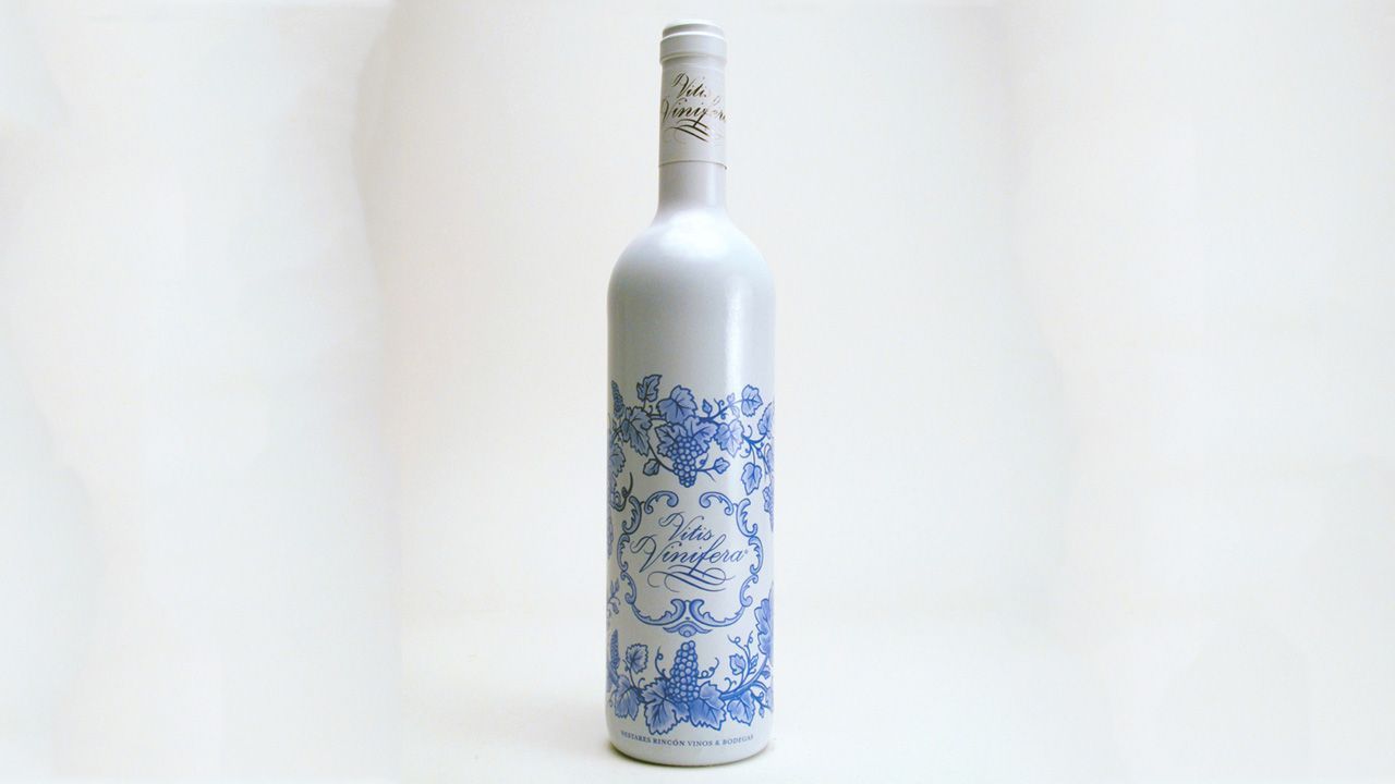
Consequently, the packaging aims at being reminiscent of antiquity pharmacy. The bottle is covered in a sleeve that reminds us of the traditional ceramic jars. This bottle also stands out on the shelves because of its unusual white colour.
Iván Bravo, “La Vinya del Vuit”
This bottle got the Laus Silver Award in 2012 for its packaging. If you look closely, you’ll see the number 8 on the bottom left corner. The rest is “a poetic interpretation of Priorat’s landscape”.
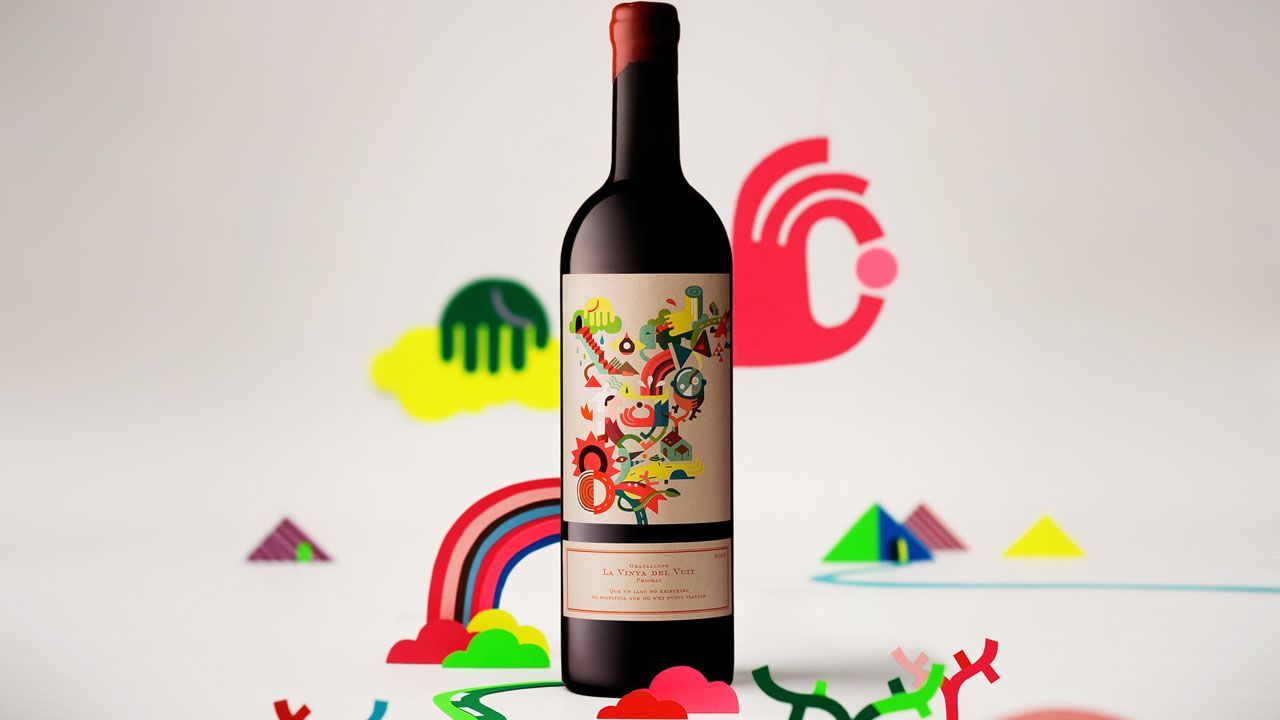
In the artist Yván Bravo’s own words: “Through the specific visual language and sampled colours opposed to the principles of wine tradition, an unrealistic and bright symbolic world blooms to tell a story about the character and boldness of the 2009 harvest.” This unconventional explosion of colours sure makes this bottle stand out.
Javi Garduño “Strike wine”, Strike wine
“The client described the wine as “a pleno wine”, from there he gave us absolute freedom to develop the product, from naming to packaging.”
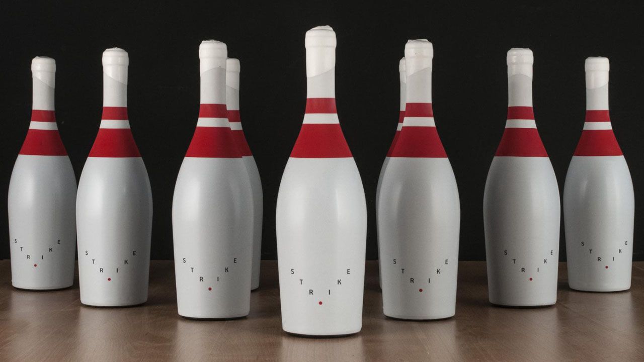
So, this is how it all started. This bowling pin bottle of wine was born out of a pun as “pleno” refers to a strike in Spanish as well. From this idea, Javi Garduño developed a pin-looking bottle, which is certainly a very striking bottle that catches the eye on the shelves! This unconventional bottle got the bronze 2018 Laus Award for packaging.
Shumi Love Design, “Spain I Need You!”, Fortuna Wines
This set of bottles was destined to foreign markets. Its aim was thus to sell a “Brand Spain”.
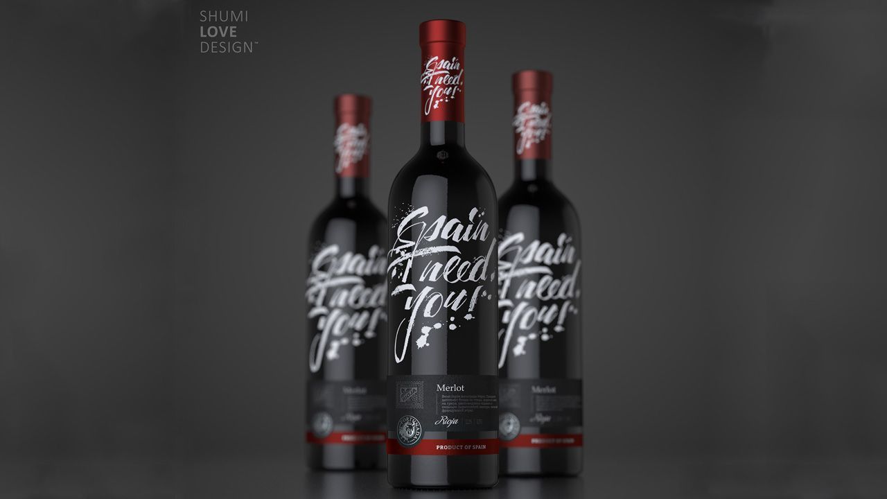
The foil and the “Made in Spain” mention share the same colour while the rest of the label is in black and white, thus emphasizing the “Brand Spain”. The “Spain, I Need You!” catchphrase, according to the designers, “sounds like a passionate cry of a person that wants to be there right now, feel the country’s unique character, enjoy its summer warmth, dive into a whirlpool of emotions.”
Calcco, Siete Pasos Wines, Bodega Peñafiel
This creative wine saga stands out with its unique and cheeky design. Each wine of this series seems to have its own personality, embodied by a stock character. This personification of the wine summed up in a single figure helps to grasp the wine identity and taste.
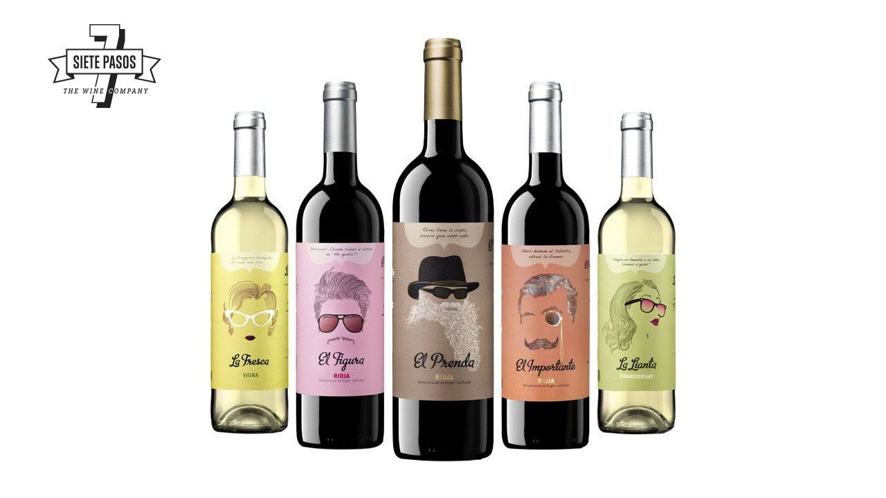
“Each wine tells you a story” is written on Siete Pasos Wines website. And indeed, each wine is a character and each drink a journey. This unique conceptual and graphic design was thought through by Calcco, a design studio specialized in wine packaging and based in Logroño.
Eduardo del Fraile, “Extenso”, Carchelo Wines
Simple and elegant, this black and white matt Magnum bottle and its container box were designed by Eduardo del Fraile.
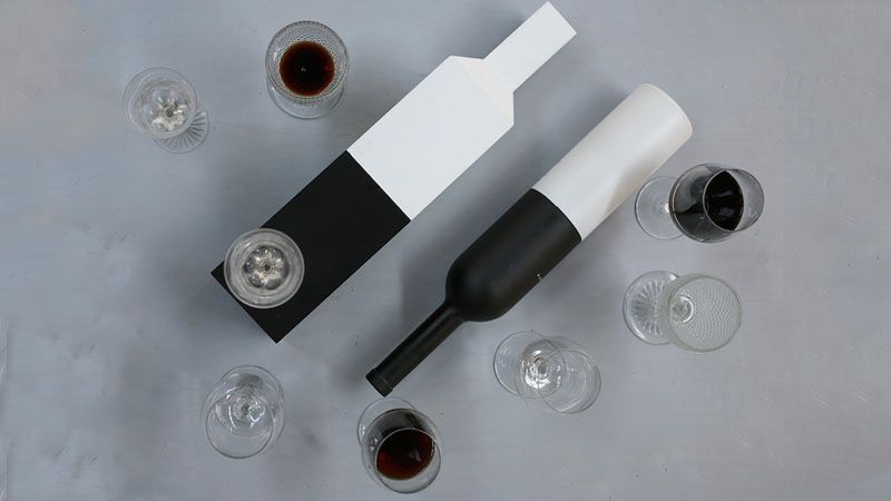
The idea of sharing is central in this bottle design. It is to be spotted in the name, Extenso, which conveys the idea of prolonging. But also in the fact that this is a Magnum bottle (1.5 litres), meant to be shared. Another important concept was elegance and simplicity. The container box was also taken into account and considered as a valuable and elegant object.
Enric Aguilera Asociados, Verano De España
“How to design wine packaging with a Spanish character, where the main ingredients are good humour and souvenir aesthetic?” Enric Aguilera Asociados wondered when designing Verano de España bottles.
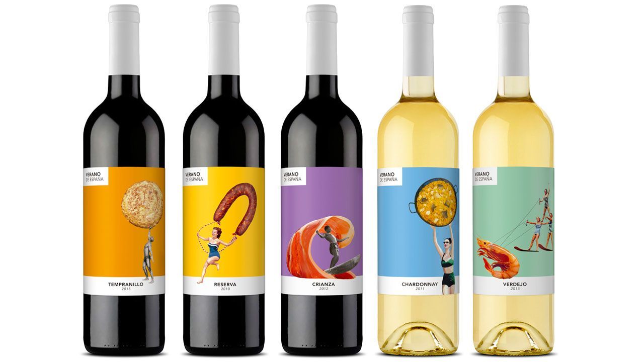
With a touch of vintage and colourful labels, this set of good-humoured wine bottles display traditional Spanish food (tortilla, chorizo, paella…) on wine bottle. The bright colours used convey the idea of happiness, summer and friendliness; everything that Spain is!
Wine, Spain and design: the perfect combo! So why not choosing Spain and Valencia to study design?
